Measuring Aesthetic Impact in International Football
The 2026 World Cup is 15 days away, and the design race has officially concluded. We are moving away from template-heavy, cookie-cutter repetition toward distinct national identities that lean heavily on archival motifs and progressive textile patterns.
This ranking prioritizes material innovation, cultural resonance, and the objective visual pop of each federation's new release. A kit succeeds when it balances on-pitch utility against the demands of the global retail market.
10. The Minimalism of Nigeria
Nigeria’s latest iteration strips back the experimental maximalism of their 2018 peak. It utilizes a cleaner, forest-green base with subtle geometric detailing that rewards close inspection. While it lacks the sheer audacity of previous versions, the restraint shown by Nike here provides a professional, sharp look that ages better than high-concept patterns.
9. Germany’s Traditional Pivot
Adidas returned to a classic white-and-black palette with subtle silver accents that evoke the 1990 tournament. By omitting the distracting gradients of recent cycles, the DFB has secured a design that feels timeless rather than dated. It sits low on this list because while the design is safe, it refuses to take risks that might alienate the traditionalist fanbase.
8. Senegal’s Terracotta Shift
Senegal has opted for a bold, earth-toned terracotta colorway that separates them from the standard PUMA team-wear templates. This choice highlights the federation’s focus on unique identity over mass-produced design. The decision to use clean navy collars provides a necessary contrast that ties the visual identity together effectively.
7. Argentina’s Sun-Soaked Stripes
The iconic sky blue and white stripes remain, but the 2026 update introduces a slight shimmer to the blue panels. This fabric choice mimics the reflective quality of the South American heat. It is a subtle upgrade to a legendary look that avoids the pitfall of changing for the sake of change.
6. South Korea’s Digital Gradient
South Korea’s kit employs a high-contrast transition from red to black that feels built for modern television broadcasts. The pattern is intentionally aggressive and reflects the high-intensity transition game favored by the current squad. It sits firmly mid-pack because the aesthetic is polarizing for proponents of classic design.
5. Brazil’s Canary Perfection
Brazil manages to refresh the most recognizable kit in sports without ruining it. The yellow is deeper, leaning toward a golden hue that feels premium in high-definition capture. While some fans loathe the recent kit unveilings, this specific design avoids the clunky logos that marred the 2022 rollout.
4. Japan’s Origami-Inspired Geometric
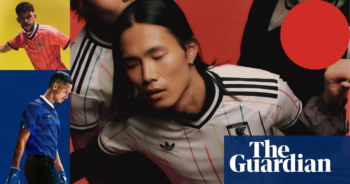
Japan continues to produce the most technically complex patterns in international football. The kit features a multi-layered origami-fold aesthetic that suggests depth and motion even when the player is static. It remains one of the few kits that justifies a higher price point through sheer creative output.
3. The Netherlands’ Vibrant Orange
The Dutch have leaned fully into their signature color, stripping away the black accents often forced into previous designs. By using a monochromatic approach with embossed lion detailing, they have achieved a sophisticated elegance. It is the best use of a single-color identity in this year’s tournament pool.
2. France’s Deep Navy Refinement
France has moved toward a near-black midnight navy that looks devastatingly sharp under floodlights. The metallic gold trim provides a precise, championship-level contrast that feels expensive and intentional. This set is a masterclass in using color density to create a sense of intimidation on the pitch.
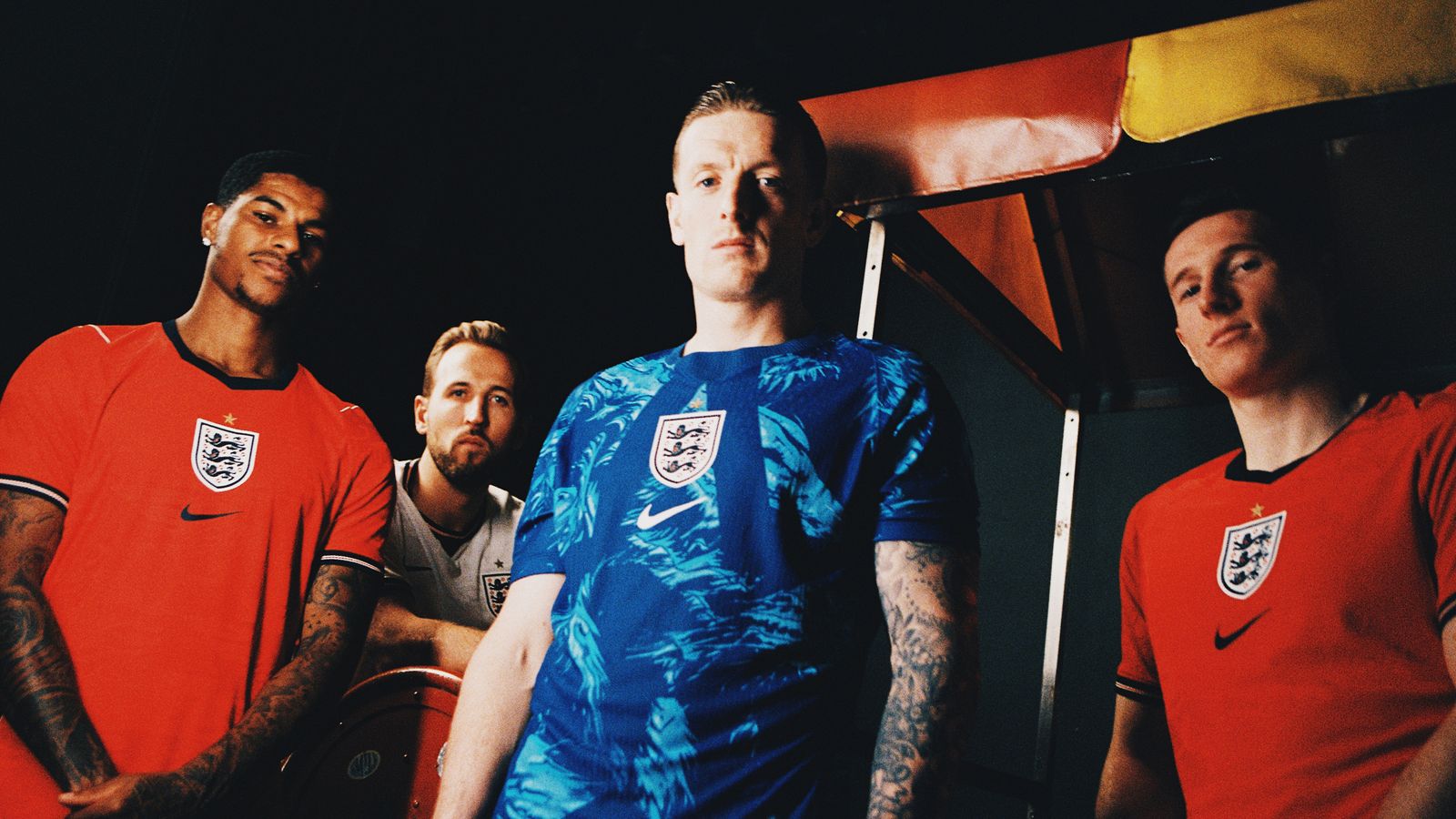
1. England’s Retro-Modern Revival
England secures the top spot by perfectly balancing the classic 1966 aesthetic with lightweight synthetic fibers. The crew-neck collar and the placement of the crest are deliberate nods to heritage but avoid feeling like a museum piece. Other federations often stumble when chasing nostalgia, but this execution is flawless and functional.
The Big Picture
Competition committees are increasingly pushing for high-visibility patterns that benefit live-stream bitrate stability during fast-paced play. The 2026 tournament proves that global brands are finally prioritizing localized aesthetics over generic corporate templates.
Honorable mentions go to Portugal for their clean white away kit and Mexico for the return of the dark green home shirt. Both narrowly missed the top 10 due to issues with collar ergonomics that reportedly distracted players during training camp.