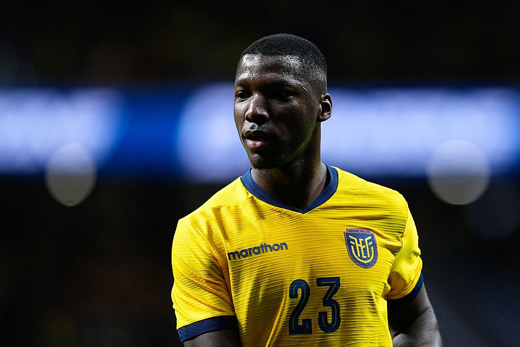
England’s new World Cup kits are a masterclass in boring minimalism

The weight of expectation, stitched into polyester
There is a peculiar, almost ritualistic anxiety that descends upon the English football public every few years. It isn’t just about the squad selection, the tactical tinkering of the manager, or the inevitable agonizing wait for a penalty shootout. It is about the kit. The shirt is more than just a piece of performance-grade fabric; it is the national identity, a canvas upon which we project our hopes, our fears, and our deep-seated need for aesthetic validation.
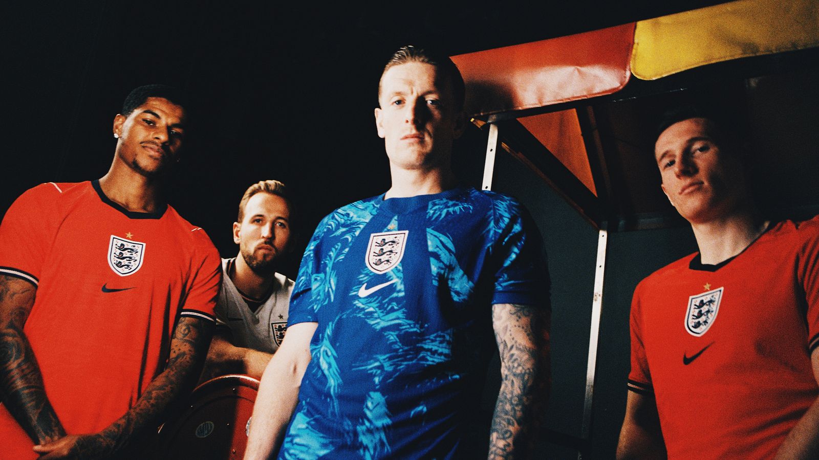
This week, the FA finally pulled back the curtain on the kits that will accompany the Three Lions to this summer's World Cup. In an era where football fashion has become a multi-billion pound industry, the reveal felt less like a revolutionary step forward and more like a polite, calculated nod to the status quo. It is a design that is safe, undeniably clean, and perhaps just a little bit sterile.
A study in restrained tradition
When you strip away the marketing jargon about 'dynamic moisture-wicking technology' and 'cultural heritage motifs,' you are left with a design that leans heavily into the archives. The home shirt is a stark, crisp white—a shade so bright it almost demands a pair of sunglasses on a sunny afternoon at Wembley. The trim is minimal, opting for subtle accents that avoid the garish experimentation that defined the mid-2000s.
It is the kind of kit that looks perfectly acceptable on a shelf but lacks the soul-stirring audacity of an instant classic. There is no bold graphic pattern, no daring collar experimentation, and certainly no attempt to reinvent the wheel. It is, for better or worse, the quintessential modern template.
The shirt is a mirror of the team itself: disciplined, organized, and perhaps a little too afraid to take a risk when the lights are brightest.
The away kit: A deviation into the safe zone
If the home kit is a tribute to tradition, the away kit is a shrug of the shoulders. Historically, England’s secondary shirts have been the home of our most flamboyant design choices. We have seen the iconic red of 1966, the bizarre grey of Euro 96, and the occasional foray into navy blue that feels like a rebellious teenager trying to find their identity. This year, the choice is functional, if uninspired.
The color palette is muted, designed to blend into a wardrobe rather than stand out on the pitch. While it will undoubtedly sell millions of units to fans looking for something 'smart-casual' to wear to the pub, it misses the opportunity to capture the imagination. In a tournament where every team is looking for that psychological edge, you have to wonder if the designers at Nike played it a bit too safe.
The commerce of the crest
We must address the elephant in the room: the price tag. In a cost-of-living crisis, the rollout of a 'premium' match-day shirt at a price point that rivals a decent weekend getaway feels increasingly tone-deaf. The football kit has transitioned from a fan’s badge of honor to a luxury fashion item, and this latest iteration does nothing to challenge that trajectory.
- The 'Authentic' version features high-spec fabric but remains prohibitively expensive for the average match-going supporter.
- The 'Replica' version, while more accessible, still commands a price that makes the average parent wince at the checkout counter.
- The design longevity is questionable; in two years, these kits will be replaced, rendered obsolete by the relentless churn of the kit cycle.
Performance over panache
Ultimately, the players won't care about the aesthetic nuances of the collar or the specific shade of the crest. They will care about how the fabric feels in the stifling humidity of the host nation and whether the shirt carries the weight of history or the lightness of a fresh start. We have seen teams win tournaments in hideous kits and lose them in sartorial perfection. The shirt is just the uniform; the history is written in the ninety minutes of play.
Perhaps the minimalism is a deliberate choice. By removing the distractions of loud patterns and chaotic designs, the FA might be signaling a desire for a 'clean slate' approach to this tournament. If the team can match the crispness of the white shirt with a similarly sharp, clinical performance on the pitch, then the design will be remembered as a classic regardless of its simplicity.
The verdict of the terraces
Walking through the streets of London or Manchester, you will see these shirts everywhere within a month. They will be worn by children in the park, by fans in the stadium, and by tourists in the city center. The success of a kit is rarely measured by the opinion of high-fashion critics; it is measured by its ubiquity. By choosing a design that is universally inoffensive, the FA has ensured that this kit will be a commercial success.
However, as a footballing nation, we should perhaps demand more. We have a rich history of iconic imagery, from the Umbro classics of the nineties to the bold, experimental kits of the past. To settle for a template that looks like it could belong to a dozen other nations is a missed opportunity to cement a visual legacy. We aren't asking for the world, but a little bit of personality wouldn't go amiss.
As we head into the summer, the focus will inevitably shift from the stitching to the starting eleven. Harry Kane, Jude Bellingham, and Phil Foden will step out onto the grass, and for a few hours, the design of the shirt will be the last thing on our minds. If the result is right, these kits will be cherished as the 'World Cup shirts.' If the result is wrong, they will be relegated to the back of the closet, a forgotten relic of another summer of 'what ifs.'
Ultimately, football is about the narrative. The shirt is merely the binding of the book. Let us hope that the story written inside this particular cover is one worth remembering for decades to come.
EA Sports FC 24 (Standard Edition) - PlayStation 5
The ultimate digital pitch where you build your dream squad and own the Premier
Frequently Asked Questions
What is the design style of the new England World Cup kits?
How does the new home kit compare to past England designs?
What is the author's opinion on the new England away kit?
Why does the article criticize the pricing of the new kits?
What does the author suggest the kit design reflects about the team?
More Coverage

Why England must fear Panama's disciplined low block
4 hours ago
Arsenal and England breathe sigh of relief as Bukayo Saka manages training load
13 hours ago
Top 10: Defining FIFA World Cup Moments of the 21st Century
16 hours ago
Top 10: Defining World Cup Moments of the Modern Era
1 day, 9 hours ago
Glenn Hoddle questions Thomas Tuchel's logic on England's World Cup squad
1 day, 10 hours agoEngland are bottling the 2026 World Cup before it even starts
1 day, 11 hours agoMore Match Reports
Nike and Adidas dropped the World Cup kits and they are absolute trash
1 month, 4 weeks ago
World Cup 2026 kit reveals are a masterclass in corporate greed
1 month, 4 weeks ago
England's new World Cup kits are here, but the midfield is still a mess
2 months ago
Top 10: The Definitive Kit Power Rankings for 2026
2 days, 13 hours ago
Nike forgot how to sew a shoulder and the World Cup is two months away
1 month, 3 weeks ago