Fashion crimes on the biggest stage on earth
We are exactly one day away from the 2026 World Cup kickoff, and while we should be hyper-focused on squad depth and defensive rotations, I’m stuck looking at the absolute visual monstrosities these kit manufacturers have unleashed. Forty-eight teams, forty-eight home shirts, and enough questionable design choices to make a colorblind referee wince. It is a cynical, corporate-driven march toward mediocrity that suggests nobody in the boardroom has actually watched a match in a downpour.
The race to the bottom of the design bin
Nike clearly decided that if they couldn't make the shirts look good, they would make them look expensive. There is a staggering amount of over-engineering happening with venting patterns and unnecessary sublimated prints. You look at some of these nations and you have to wonder if the designers were actively trying to camouflage the players against the pitch turf. When we hit the opening whistle in Toronto, the contrast—or lack thereof—is going to be a nightmare for anyone squinting at a pub television.
Why less is never enough for the big brands
Adidas, meanwhile, seems to have fallen into a loop of recycling 1990s templates that nobody actually liked the first time around. We aren't getting retro cool; we are getting thrift store leftovers priced at $160 a pop. It is pure retail laziness meant to capitalize on the nostalgia cycle, yet it feels as hollow as a pre-season friendly in humid conditions.
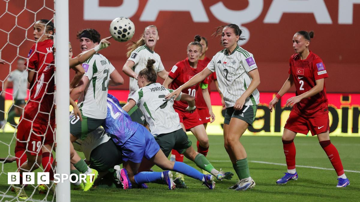
- USA: Trying way too hard with the patriotic gradients.
- Mexico: The Aztec-inspired textures are actually busy enough to induce a seizure under stadium LEDs.
- Japan: A rare win, keeping it sharp enough to justify the price tag.
- Brazil: Standard, but somehow feels like a carbon copy of the last four cycles.
The Mirror Football kit rankings highlight just how much these brands have drifted from the actual identity of the sport. Fans are expected to shell out top-tier cash for jerseys that look like they were generated by a broken algorithm after three espressos. It is a cash grab hiding behind the guise of a celebration.
The real loser is the aesthetic of the tournament
I get it, branding experts argue that high-tech fabrics are needed for player performance. But we aren't the ones running box-to-box for 90 minutes; we are the ones watching from the bar stools. If I have to spend my hard-earned money to support my side, I want something that doesn't belong in a bargain bin at a suburban soccer camp.
We have 48 teams competing for the most illustrious trophy in the world, yet we are being served visual slop. Some of these kits look like they were finalized by a committee that hasn't seen grass since the 2014 tournament. It’s not just about the fashion; it’s about the fact that players carry the weight of their nations on their chests, and right now, many of those chests look like they are advertising a headache.
If only the marketing departments put as much effort into quality control as they did into inflating profit margins, we might have something worth wearing in public. Instead, we have a tournament that feels like a walking, talking billboard for synthetic fibers and missed opportunities. Don't be surprised when the televised footage shows these kits suffering under the glare of the north american sun, leaving players looking like they are wrestling in wet plastic wrap.
Read Next
- The World Cup kickoff is 24 hours away and the tension is rising
- The World Cup's missing referee shows the human cost of administrative failure
- Arsenal and England are drifting toward a fitness crisis
- Thomas Tuchel is trying to gaslight England fans before the World Cup
- 🏆 World Cup 2026 — Full Coverage Hub